在 Odoo 18 中创建进度条
一、创建进度条模板
首先在名为 progress_bar_widget.xml 的文件中定义一个名为 ProgressBarWidget 的新模板。该模板使用两个 CSS 类:progress-bar-inner 用于样式化进度条,progress_number 用于显示进度百分比。您可以根据需要自定义外观和样式。
<?xml version="1.0" encoding="utf-8"?>
<templates id="template" xml:space="preserve">
   <t t-name="ProgressBarWidget" owl="1">
       <div t-ref="ProgressBarWidget-root">
           <div class="progress_bar">
               <div class="pro-bar">
                   <span class="progress-bar-inner"/>
                   <span class="progress_number"/>
               </div>
           </div>
       </div>
   </t>
</templates>
二、为进度条添加样式
使用 CSS 定义进度条的样式:
- .progress-bar-inner 类控制进度条的宽度和背景颜色
- .progress_number 定位百分比文本
.progress_bar .pro-bar {
   background: hsl(0, 0%, 97%);
   box-shadow: 0 1px 2px hsla(0, 0%, 0%, 0.1) inset;
   height: 4px;
   width: 200px;
   margin-bottom: 15px;
   margin-top: 10px;
   position: relative;
}

.progress_bar .progress_number {
   float: right;
   margin-top: -6px;
   margin-right: -50px;
}

.progress_bar .progress-bar-inner {
   background-color: green;
   display: block;
   width: 0;
   height: 100%;
   position: absolute;
   top: 0;
   left: 0;
   transition: width 1s linear 0s;
}

.progress_bar .progress-bar-inner:before {
   content: "";
   background-color: hsl(0, 0%, 100%);
   border-radius: 50%;
   width: 4px;
   height: 4px;
   position: absolute;
   right: 1px;
   top: 0;
   z-index: 1;
}

.progress_bar .progress-bar-inner:after {
   content: "";
   width: 14px;
   height: 14px;
   background-color: inherit;
   border-radius: 50%;
   position: absolute;
   right: -4px;
   top: -5px;
}
三、更新进度条的 JavaScript 逻辑
使用 JavaScript 创建进度条的逻辑。组件将通过 setup 方法初始化,并通过 onUpdateProgressBar 函数更新进度条。该函数根据提供的值(浮点数或整数)计算进度条的宽度。
/** @odoo-module **/
import { registry } from "@web/core/registry";
Import { standardFieldProps } from "@web/views/fields/standard_field_props";
import { Component, useRef, onMounted, onPatched } from "@odoo/owl";

export class ProgressBarWidget extends Component {
    setup() {
        this.root = useRef('ProgressBarWidget-root');
        onMounted(this.onUpdateProgressBar);
        onPatched(this.onUpdateProgressBar);
    }

    onUpdateProgressBar() {
        if (this.props.record.data[this.props.name] <= 100) {
            this.widthComplete = parseInt(this.props.record.data[this.props.name] / 100 * 100);
        } else {
            this.widthComplete = 100;
        }

        this.root.el.querySelector('.progress-bar-inner').style.width = this.widthComplete + '%';
        this.root.el.querySelector('.progress_number').textContent = this.widthComplete + '%';
    }
}

ProgressBarWidget.template = 'ProgressBarWidget';
ProgressBarWidget.props = standardFieldProps;
ProgressBarWidget.supportedTypes = ["float", "integer"];

registry.category("fields").add("progress_bar_widget", {
    component: ProgressBarWidget,
});
通过将组件添加到 "fields" 类别中,将其注册到 Odoo 注册表。该部件支持浮点数(float)和整数字段(integer)类型。
四、在表单视图中使用部件
进度条组件创建完成后,通过在 XML 表单视图中指定字段的 widget 属性来应用该组件。
<field name="progress" widget="progress_bar_widget"/>
以项目模型的 milestone_progress 字段为例,继承表单视图并替换原有字段:
<odoo>
    <record id="view_project_form_inherit" model="ir.ui.view">
        <field name="name">project.project.form.inherit</field>
        <field name="model">project.project</field>
        <field name="inherit_id" ref="project.view_project" />
        <field name="arch" type="xml">
           <xpath expr="//field[@name='milestone_progress']" position="replace">
               <field name="milestone_progress" widget="progress_bar_widget"/>
           </xpath>
        </field>
    </record>
</odoo>
最终将显示动态进度条,直观展示项目里程碑的完成情况。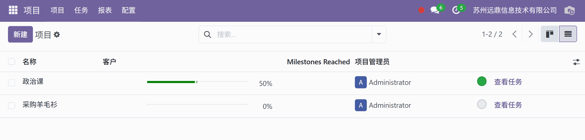
注意:项目的 "Milestones Reached" 字段的显示需要先打开项目配置中的里程碑功能。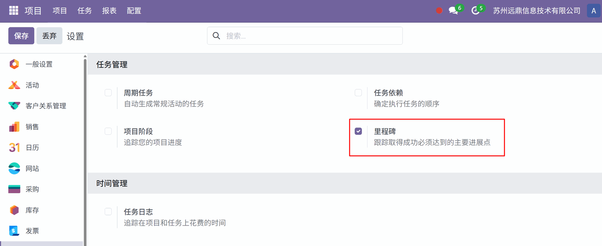
结语
通过 Odoo 18 的进度条组件,您可以在多个模块中以可视化方式展示任务完成度。该方案提供了一种直观的图形化方式,用户可通过工时记录或其他相关指标自动跟踪任务进度。这不仅提升了用户体验,还使项目绩效监控变得简单且直观。